Code
import numpy as np
import matplotlib.pyplot as plt
import os.path

# Define path to data
# You will need to adjust this on the cluster
DATA_DIR = os.path.expanduser("~/data/teaching/ASTR6000-SP26")Our goal here is to compare the power spectra from the Quijote simulations to the predictions of linear theory.
You can find the details of the Quijote simulations here.
We are using a subset of the Quijote simulations for this analysis; these will be made available on the cluster (the directory will be shared separately). The notebook here uses a directory structure set up on my laptop/desktop, so you will need to adjust these if you want to run this notebook.
import numpy as np
import matplotlib.pyplot as plt
import os.path
# Define path to data
# You will need to adjust this on the cluster
DATA_DIR = os.path.expanduser("~/data/teaching/ASTR6000-SP26")Let us start by loading in one simulation from the Quijote suite and plotting the power spectrum at \(z=0\) and compare it to the input linear theory power spectrum.
# Load the power spectrum data from the Quijote simulation
sim_num = 10000
sim_pk_file = os.path.join(DATA_DIR, "Quijote-Pk", f"{sim_num}", "Pk_m_z=0.txt")
k_sim, pk_sim = np.loadtxt(sim_pk_file, unpack=True)

# Load the linear theory power spectrum
linear_pk_file = os.path.join(DATA_DIR, "Quijote-Pk", "CAMB_matterpow_0.dat")
k_linear, pk_linear = np.loadtxt(linear_pk_file, unpack=True)
normfac_file = os.path.join(DATA_DIR, "Quijote-Pk", "Normfac.txt")
normfac = np.loadtxt(normfac_file)
pk_linear *= normfac # Normalize to match the simulationfig, (ax1, ax2) = plt.subplots(2, 1, figsize=(8, 8),
gridspec_kw={'height_ratios': [3, 1], 'hspace': 0.05})
# Upper panel: Power spectra
ax1.loglog(k_linear, pk_linear, 'k-', label='Linear Theory (CAMB)', alpha=0.7, lw=2)
ax1.loglog(k_sim, pk_sim, 'r-', label=f'Quijote Sim {sim_num}', alpha=0.8, lw=1.5)
ax1.set_ylabel(r'$P(k)$ [$(h^{-1}\mathrm{Mpc})^3$]', fontsize=12)
ax1.set_xlim([1e-3, 1])
ax1.set_ylim([1e2, 5e4])
ax1.legend(fontsize=11)
ax1.grid(True, alpha=0.3)
ax1.set_xticklabels([])
# Lower panel: Ratio
k_interp = k_sim
pk_linear_interp = np.interp(k_interp, k_linear, pk_linear)
ratio = pk_sim / pk_linear_interp
ax2.semilogx(k_interp, ratio, 'b-', lw=1.5)
ax2.axhline(1.0, color='k', linestyle='--', alpha=0.5, lw=1)
ax2.set_xlabel(r'$k$ [$h\,\mathrm{Mpc}^{-1}$]', fontsize=12)
ax2.set_ylabel(r'$P_{\rm sim}/P_{\rm linear}$', fontsize=12)
ax2.set_xlim([1e-3, 1])
ax2.set_ylim([0.5, 3.0])
ax2.grid(True, alpha=0.3)
plt.tight_layout()
plt.show()/var/folders/5s/z32x1yyd4wd7q51zc60yx_0c0000gn/T/ipykernel_77789/2848609612.py:27: UserWarning: This figure includes Axes that are not compatible with tight_layout, so results might be incorrect.
plt.tight_layout()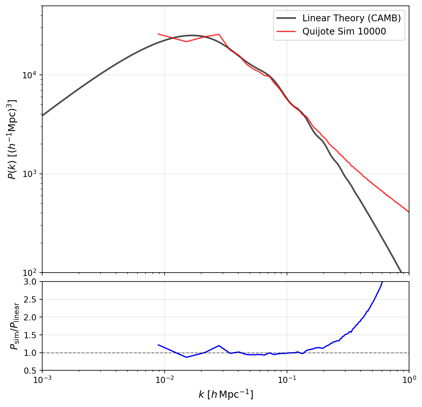
In the plot above, observe the following features:
Quijote has a very large number of simulations. Let us take 10 of these and average them together to see how the scatter reduces on large scales.
# Load multiple simulations and compute the mean
sim_nums = range(10000, 10010)  # Simulations 10000-10009
pk_sims = []

for sim_num in sim_nums:
    sim_pk_file = os.path.join(DATA_DIR, "Quijote-Pk", f"{sim_num}", "Pk_m_z=0.txt")
    k, pk = np.loadtxt(sim_pk_file, unpack=True)
    pk_sims.append(pk)

# Convert to array and compute mean
pk_sims = np.array(pk_sims)
pk_mean = np.mean(pk_sims, axis=0)fig, (ax1, ax2) = plt.subplots(2, 1, figsize=(8, 8),
gridspec_kw={'height_ratios': [3, 1], 'hspace': 0.05})
# Upper panel: Power spectra
# Plot individual simulations as faint lines
for pk_sim in pk_sims:
ax1.loglog(k, pk_sim, 'gray', alpha=0.3, lw=0.5)
# Plot mean and linear theory
ax1.loglog(k_linear, pk_linear, 'k-', label='Linear Theory (CAMB)', alpha=0.7, lw=2)
ax1.loglog(k, pk_mean, 'r-', label='Mean of 10 Sims', alpha=0.8, lw=2)
ax1.set_ylabel(r'$P(k)$ [$(h^{-1}\mathrm{Mpc})^3$]', fontsize=12)
ax1.set_xlim([1e-3, 1])
ax1.set_ylim([1e2, 5e4])
ax1.legend(fontsize=11)
ax1.grid(True, alpha=0.3)
ax1.set_xticklabels([])
# Lower panel: Ratio
pk_linear_interp = np.interp(k, k_linear, pk_linear)
ratio_mean = pk_mean / pk_linear_interp
ax2.semilogx(k, ratio_mean, 'r-', lw=2, label='Mean')
# Also plot individual ratios faintly
for pk_sim in pk_sims:
ratio_sim = pk_sim / pk_linear_interp
ax2.semilogx(k, ratio_sim, 'gray', alpha=0.3, lw=0.5)
ax2.axhline(1.0, color='k', linestyle='--', alpha=0.5, lw=1)
ax2.set_xlabel(r'$k$ [$h\,\mathrm{Mpc}^{-1}$]', fontsize=12)
ax2.set_ylabel(r'$P_{\rm sim}/P_{\rm linear}$', fontsize=12)
ax2.set_xlim([1e-3, 1])
ax2.set_ylim([0.5, 3.0])
ax2.grid(True, alpha=0.3)
plt.tight_layout()
plt.show()/var/folders/5s/z32x1yyd4wd7q51zc60yx_0c0000gn/T/ipykernel_77789/236953992.py:35: UserWarning: This figure includes Axes that are not compatible with tight_layout, so results might be incorrect.
plt.tight_layout()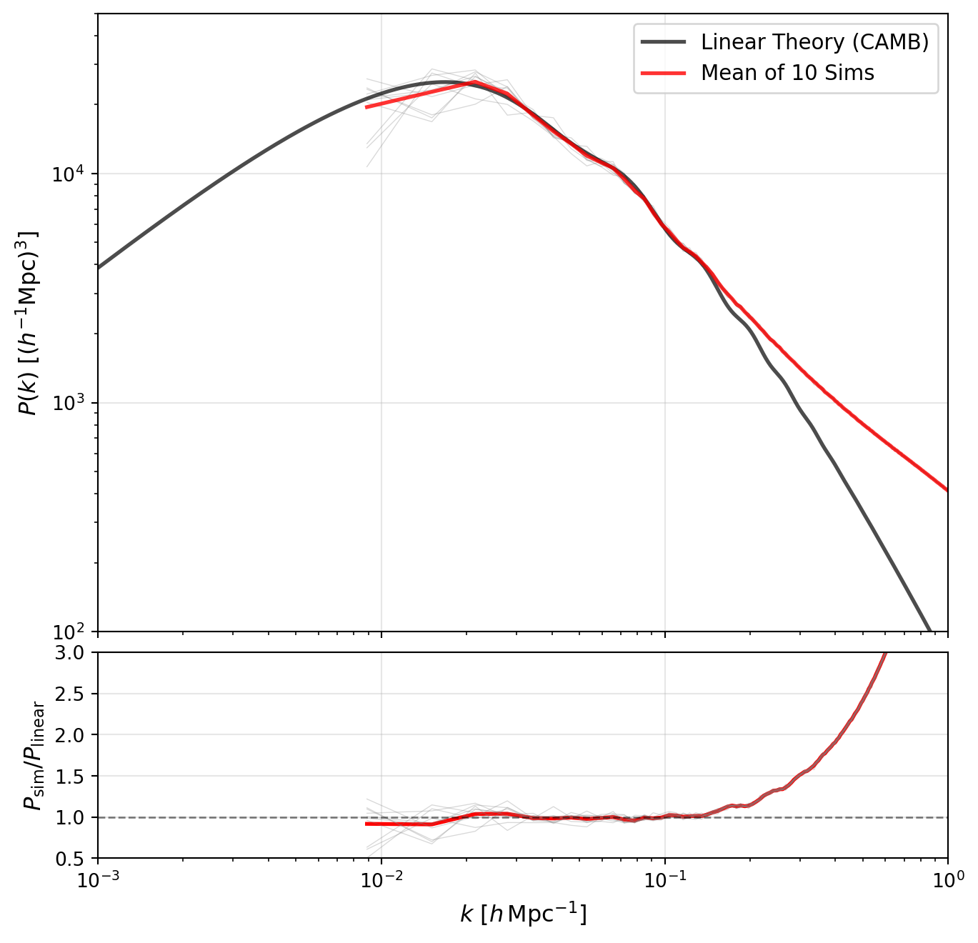
We can now turn to the redshift evolution of the power spectrum. Quijote provides power spectra at multiple redshifts, so we can compare how the simulation evolves with redshift to the linear theory prediction.
As an initial comparison, we’ll look at a single simulation. We will estimate the growth factor directly from the simulation by directly taking the ratio of the first power spectrum point in k to the value at \(z=0\), and then apply this to the linear theory power spectrum.
# Redshift values available in Quijote
zvals = [0, 0.5, 1, 2, 3, 127]

# Load power spectra for one simulation at all redshifts
sim_num = 10000
pk_by_z = {}
k_z = None

for z in zvals:
    z_tag = f"{z:g}"
    sim_pk_file = os.path.join(DATA_DIR, "Quijote-Pk", f"{sim_num}", f"Pk_m_z={z_tag}.txt")
    k_this, pk_this = np.loadtxt(sim_pk_file, unpack=True)
    if k_z is None:
        k_z = k_this
    pk_by_z[z] = pk_this

pk_z0 = pk_by_z[0]

# Estimate linear growth from the largest-scale mode (first k-bin)
growth2_by_z = {z: pk_by_z[z][0] / pk_z0[0] for z in zvals}

colors = plt.cm.viridis(np.linspace(0.1, 0.95, len(zvals)))

# Build linear-theory predictions at each redshift via P_lin(k, z) = D(z)^2 P_lin(k, z=0)
pk_linear_interp_z0 = np.interp(k_z, k_linear, pk_linear)
pk_linear_by_z = {z: growth2_by_z[z] * pk_linear_interp_z0 for z in zvals}fig, ax = plt.subplots(figsize=(8, 5.5))
for z, color in zip(zvals, colors):
scale = 100.0 if z == 127 else 1.0
z_label = fr"$z={z:g}$ (x100)" if z == 127 else fr"$z={z:g}$"
ax.loglog(k_z, scale * pk_by_z[z], color=color, lw=1.8, label=fr"Sim {z_label}")
ax.loglog(k_z, scale * pk_linear_by_z[z], color=color, lw=1.4, ls="--", alpha=0.9)
ax.set_xlabel(r"$k$ [$h\,\mathrm{Mpc}^{-1}$]", fontsize=12)
ax.set_ylabel(r"$P(k)$ [$(h^{-1}\mathrm{Mpc})^3$]", fontsize=12)
ax.set_xlim([1e-3, 1])
ax.set_ylim([1e-1, 5e4])
ax.grid(True, alpha=0.3)
ax.legend(ncol=2, fontsize=9)
plt.tight_layout()
plt.show()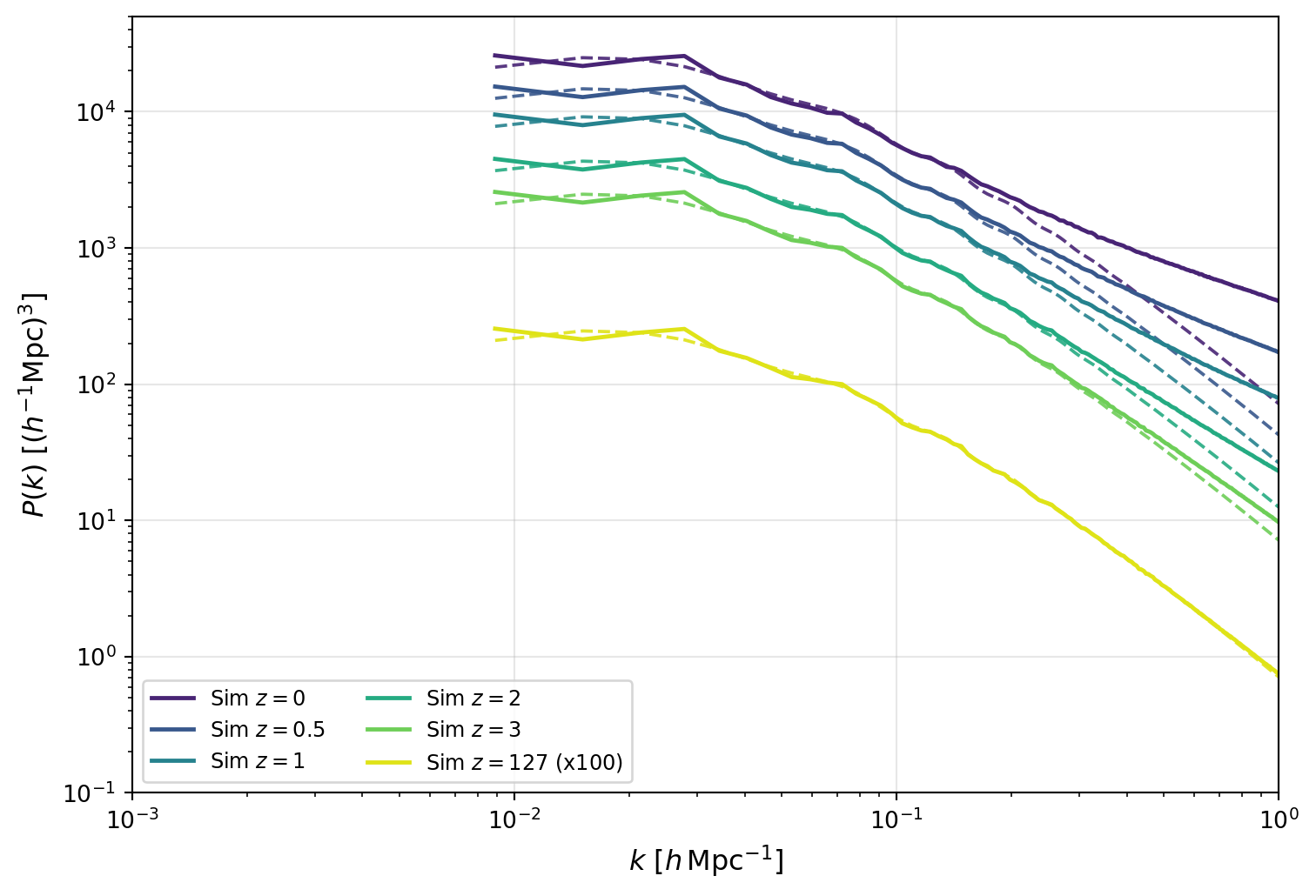
The figure above shows the growth of fluctuations clearly: as time progresses toward lower redshift, the overall amplitude of \(P(k)\) increases across all scales.
Comparing each simulation curve to its growth-scaled linear prediction (same color, dashed) shows where linear theory begins to fail. The disagreement is strongest at large \(k\), where nonlinear mode coupling boosts power above linear expectations.
In the next figure, we compare exact \(k\)-modes directly in ratio form. This removes much of the broad amplitude evolution and makes two effects easier to see: (i) reduced apparent scatter when matching the same modes across redshifts, and (ii) scale-dependent departures from linear evolution.
fig, (ax1, ax2) = plt.subplots(
    2,
    1,
    figsize=(8, 8),
    gridspec_kw={"height_ratios": [1, 1], "hspace": 0.08},
)

# Panel 1: Ratio to z=127, additionally scaled by growth factor ratio
pk_z127 = pk_by_z[127]
growth2_z127 = growth2_by_z[127]

for z, color in zip(zvals, colors):
    ratio_z127_growth_scaled = (pk_by_z[z] / pk_z127) / (growth2_by_z[z] / growth2_z127)
    ax1.semilogx(k_z, ratio_z127_growth_scaled, color=color, lw=1.8, label=fr"$z={z:g}$")

ax1.axhline(1.0, color="k", linestyle="--", alpha=0.5, lw=1)
ax1.set_ylabel(r"$\left[P(k,z)/P(k,127)\right]/\left[D^2(z)/D^2(127)\right]$", fontsize=12)
ax1.set_xlim([1e-3, 1])
ax1.set_ylim([0.5, 3.5])
ax1.grid(True, alpha=0.3)
ax1.legend(ncol=3, fontsize=10)
ax1.set_xticklabels([])

# Panel 2: Ratio to linear theory at each redshift
for z, color in zip(zvals, colors):
    ratio_linear = pk_by_z[z] / pk_linear_by_z[z]
    ax2.semilogx(k_z, ratio_linear, color=color, lw=1.8, label=fr"$z={z:g}$")

ax2.axhline(1.0, color="k", linestyle="--", alpha=0.5, lw=1)
ax2.set_xlabel(r"$k$ [$h\,\mathrm{Mpc}^{-1}$]", fontsize=12)
ax2.set_ylabel(r"$P(k,z)/P_{\rm lin}(k,z)$", fontsize=12)
ax2.set_xlim([1e-3, 1])
ax2.set_ylim([0.4, 3.5])
ax2.grid(True, alpha=0.3)

plt.tight_layout()
plt.show()
/var/folders/5s/z32x1yyd4wd7q51zc60yx_0c0000gn/T/ipykernel_77789/3432839178.py:36: UserWarning: This figure includes Axes that are not compatible with tight_layout, so results might be incorrect.
plt.tight_layout()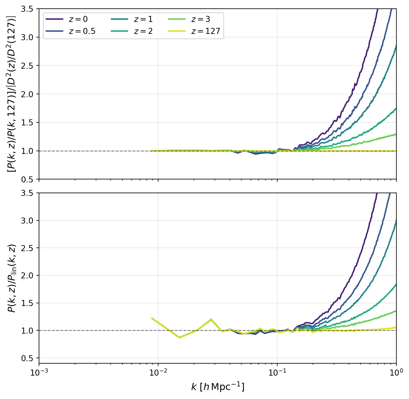
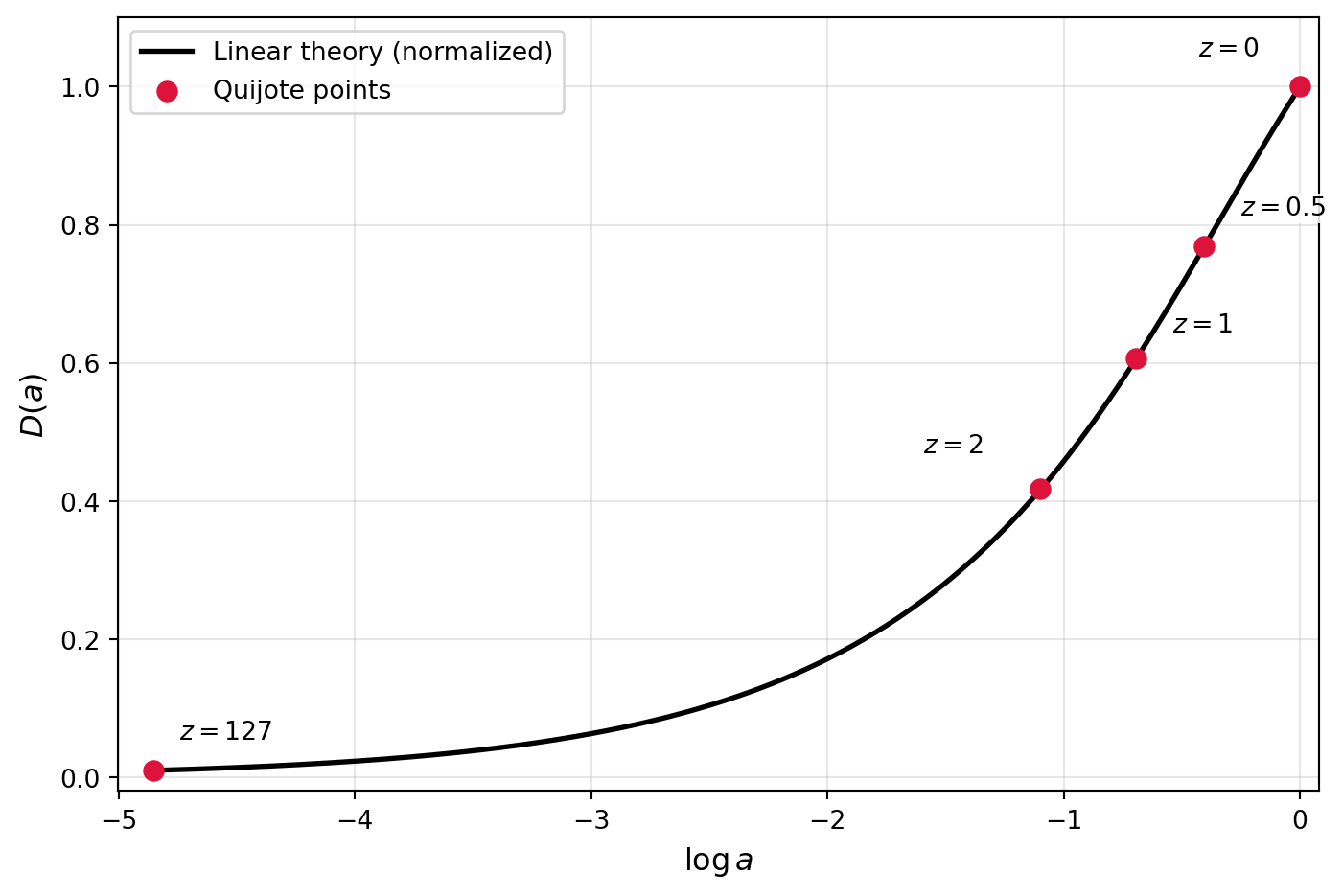
We can now directly compare the growth function estimated from the simulations to the theoretical prediction from linear theory.
To compute the theoretical growth function, we’ll use the formula in the HW, valid for a flat Universe with a cosmological constant (which matches the Quijote cosmology). \[ D(a) = \frac{5\Omega_m H(a)}{2} \int_0^a \frac{da'}{(a' H(a'))^3} \] where the factors are chosen so that \(D(a) \approx a\) at early times when matter dominates.
We won’t make this into a full-fledged function here, since we’ll only need it once in this notebook, but you can easily turn this into a reusable function if you want to compute growth factors for redshifts/cosmologies. Note that this only works for a cosmological constant.
# Define the Quijote cosmology
Omega_m = 0.3175
Omega_L = 1-Omega_m

# Define H(a) for the Quijote cosmology
def H(a):
    return np.sqrt(Omega_m / a**3 + Omega_L)

# Compute the growth function D(a) via numerical integration
from scipy.integrate import quad
def integrand(a):
    if a < 1e-4:
        # Use the matter-dominated approximation
        return (a/Omega_m)**1.5
    return 1.0 / (a * H(a))**3


def D(a):
    integral, _ = quad(integrand, 0, a)
return (5.0 * Omega_m / 2.0) * H(a) * integral# Build theory curve and normalize so D(1)=1
a_grid = np.logspace(np.log10(1.0 / (1.0 + 127.0)), 0.0, 300)
D_grid_raw = np.array([D(a) for a in a_grid])
D1 = D(1.0)
D_grid = D_grid_raw / D1
# Quijote growth points from same k-mode (k[0]) relative to z=0
z_growth = [0, 0.5, 1, 2, 127]
a_growth = np.array([1.0 / (1.0 + z) for z in z_growth])
D_quijote = np.array([np.sqrt(growth2_by_z[z]) for z in z_growth])
fig, ax = plt.subplots(figsize=(7.5, 5))
ax.plot(np.log(a_grid), D_grid, color="k", lw=2, label="Linear theory (normalized)")
ax.scatter(np.log(a_growth), D_quijote, color="crimson", s=55, zorder=3, label="Quijote points")
label_offsets = {
0: (-16, 10),
0.5: (14, 10),
1: (14, 8),
2: (-22, 12),
127: (10, 10),
}
for z, a_val, d_val in zip(z_growth, a_growth, D_quijote):
dx, dy = label_offsets[z]
ax.annotate(
fr"$z={z:g}$",
xy=(np.log(a_val), d_val),
xytext=(dx, dy),
textcoords="offset points",
ha="left" if dx >= 0 else "right",
va="bottom",
fontsize=10,
bbox=dict(facecolor="white", edgecolor="none", alpha=0.85, pad=0.8),
)
ax.set_xlabel(r"$\log a$", fontsize=12)
ax.set_ylabel(r"$D(a)$", fontsize=12)
ax.set_xlim([np.log(1.0 / (1.0 + 127.0)) - 0.15, 0.08])
ax.set_ylim([-0.02, 1.10])
ax.grid(True, alpha=0.3)
ax.legend(fontsize=10)
plt.tight_layout()
plt.show()